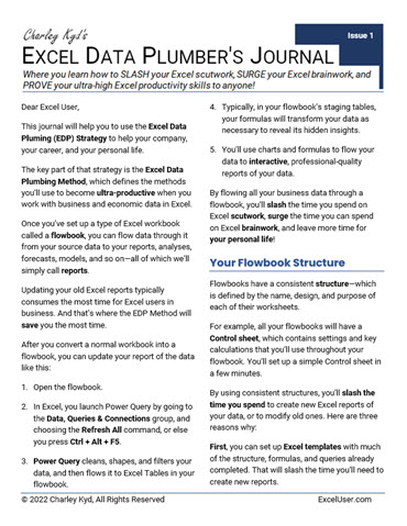
Welcome to the...
Excel Data Plumber's Journal
...where you learn to flow data from its sources to your Excel work like water through a pipe.
The EDP Journal is where you'll learn how to...
▶ SLASH your Excel errors and scutwork,
▶ SURGE your Excel brainwork,
▶ TRAP new errors automatically,
▶ SAVE time for your personal life, and,
▶ PROVE your new Excel skills & business knowledge to anyone!
The EDP Journal will take you, an Excel Data Plumber, to an ultra-productive world of flowing data, and help you to thrive there.
Charley Kyd, MBA
Former VP Finance
Former Microsoft Excel MVP
The Excel Data Plumbing (EDP) Method is the repeatable process you'll use to quickly convert raw data from (nearly) any source into accurate and insightful analyses, forecasts, dashboards, financials, and so on—all of which we'll just call reports.
The EDP Method flows data through your EDP workbooks—called flowbooks—like water through a pipe. When you issue just one command, raw data flows from distance sources, through Excel's Power Query feature and/or Pivot Tables, to data tables, often through staging tables, and then to one or more reports, including your error-trapping system—all in your flowbook. (One reason error-trapping works so well with flowbooks is because you always can compare your reports' results to one ultimate source of truth: your original source data!)
And then, to update your flowbook's reports, you issue that one command—period after period, after period.
We Excel Data Plumbers are the most productive Excel users on Earth because we quickly can create new reports from flowbook templates—which typically are connected to one or more sources of data—and because we can update and error-check our reports with one command.
In short, the EDP Method gives us TIME—time to research, to learn, to think, to create, to write, and do other value-added brainwork.
In Issue 1 of the Journal, which is free, you learn how to set up a Power Query query to import data from a CSV file, report it in Excel, and then update your report with one command.
But to become ultra-productive, you'll need to learn more—step by step.
In the movie Phenomenon, John Travolta's character quickly scanned an English-Portuguese dictionary then talked for a while with an injured Portuguese.
"George Malley!" an astonished lady said. "You learned the Portuguese language in 20 MINUTES?"
"Not all of it," he said.
I call this Malley's Law, and we'll use it extensively in the Journal. That is, to become ultra-productive in Excel, you'll need to learn something about Excel's intermediate, advanced, and guru-level features—but you WON'T need to learn all of it!
Not even most of it!
The key is to learn just enough about those features to help you do outstanding Excel work, quickly and easily—month after month.
That is, to be ultra-productive, you need CURATED training—Malley's Law training—NOT all of it!
Here's Just Some of What You'll Learn About Using Excel
You'll learn about the following topics—and more—in future issues. But in all cases, we'll take them step-by-step, using Malley's Law—so that no matter what you know about Excel and data manipulation today, you'll come to master these topics, and more.
▶ You'll learn relevant features of Power Query, Pivot Tables, slicers, VBA, DAX, the Power Pivot Data Model, Tables, CUBE functions, array formulas, dynamic range names, charts, shapes, embedding Word in your worksheets, and more.
Issue by issue, you'll learn what you need to know about those topics to become ultra-productive with Excel.
▶ You'll learn best practices for setting up your flowbooks, your formulas, your templates, your tables, your charts, your error-trapping, and so on. One reason that error-trapping works so well with flowbooks is that they always contain one ultimate source of truth: your original source data.
▶ You'll learn how to set up Really Simple Automation (RSA) of flowbook reporting and analysis, using a short VBA program. For example, one RSA program could loop through four flowbooks, with one command. And then...
- This flowbook could perform time-lagged correlation to identify leading and coincident indicators. (That is, it becomes a customizable correlation engine.)
- This flowbook could look for errors in nearly any source data. (That is, it becomes a customizable error alerting engine.)
- This flowbook could analyze the financials of any number of public companies, searching for any pattern you want to find in their data. (That is, it becomes a customizable knowledge discovery engine.)
- This flowbook could update its report, save it as a PDF, and then email it to a distribution list. (That is, it because a customizable report distribution engine.)
All four of these engines are just interactive flowbook reports or analyses that you'll learn how to set up, where—instead of using a slicer—our Really Simple Automation workbook controls their settings.
▶ You'll learn many data aggregations and transformations to reveal your data's hidden patterns. You'll learn how to calculate—and usually plot—the change index, annual rate of change, normalized data, multiple smoothing methods, cohort analysis, sorting with formulas, and more.
▶ You'll learn how to create all of the reports and charts shown at the right—most of which update with one command. (You'll receive copies of their flowbooks, of course.)
▶ You'll learn enough about the intermediate, advanced, and guru-level topics so if you need to learn more about some of them, you'll have a foundation of knowledge on which to build.
You'll also learn about two extremely valuable sources of external data:
1. The Federal Reserve Economic Database (FRED)
FRED contains more than 800,000 free data series from more than 100 U.S. and International sources.
It includes data about city, county, state, and national trends in the U.S., and also about international trends from the World Bank, OECD, IMF, and other sources.
FRED includes data about leading indicators, commodity prices, interest rates, exchange rates, inflation rates, recession indicators, real estate activity, population trends, major stock market indexes, and much, MUCH more!
2. Nasdaq's Extensive Database of Fundamental Data ("NED")
Nasdaq has decades of quarterly and annual financial statements for most public companies that have been traded in the U.S. in recent decades—that's 6,000 public companies and 10,000 delisted companies.
Because NED's data is standardized, all their financials use the same General Ledger accounts, no matter what industry they're in. And that means you can report any company you want merely by changing its ticker symbol in your flowbook.
It also means that after you map your company's chart of accounts to NED's, you'll be able to compare your company's financials to any number of NED's 16,000 public companies!
("NED" is my term, by the way. I created it to pair easily with "FRED." If you ever mention NED to people from Nasdaq, they'll have no idea what you're talking about!)
Why External Data Matters
You'll need to know about FRED and NED for at least three important reasons:
▶ For Business Context: Your managers need to understand not only WHAT happened, but WHY!
The FRED and NED data will help you and your managers to answer WHY by viewing your company's performance in the context of the performance of both the economy and your publicly traded customers and competitors.
In Excel, you'll be able to update reports with both internal and external data with one command, of course.
▶ For Training: We obviously can't use your company's data for our training.
So, starting with Issue 3 of the Journal, you'll learn how to import leading economic indicators from FRED, using Power Query. Then you'll learn how to flow that data to a dashboard report—just as you would flow your internal data.
In later issues of the Journal, I'll set up charts of account, debits and credits, and trial balances to make NED's financials as similar to your company's financial data as possible. And then we'll explore agile ways to set up your financial reports—which could include dashboards, analyses, forecasts, and so on.
▶ For Your Excel Portfolio: Your accomplishments are your credentials.
And so, to prove your new Excel skills, I'll help you to create and display an Excel Portfolio of your best work, using data from FRED and NED. And because it all will be public data, you'll be able to show your best Excel work to anyone!
Note: I've found a way to post your entire Excel Portfolio on my web site, along with SEO-rich text. That will help your Portfolio to appear high in search results. Other Excel Data Plumbers could give you feedback about it. And you could include your page's URL in your email signature and personal business cards.
It updates with only one command.
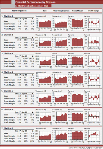
In your company, you could use a report like this to display key performance measures by division or department. Or you could show several performance measures for each of several divisions or departments.
And in your Excel Portfolio, you could set up a report like this showing public data about any topic that interests you or might interest the companies with which you meet.
A future issue of the Journal will include this dashboard and teach you how to create one like it.
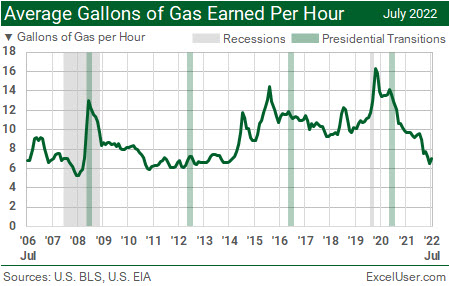
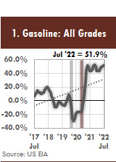
The gray columns show recessions, and the green columns show presidential transitions.
Your HR Department could create charts like this for your CEO, charts that show a line for the average gallons of gas earned per hour for different categories of employees over time.
HR could update it with one command, of course.
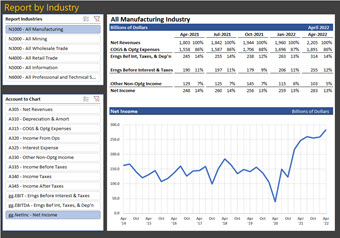
FRED publishes the QFR data starting on October 1, 2000. And this report displays that data.
The top slicer allows us to choose the major industry to display. And the bottom slicer allows us to choose the financial measure to plot in the chart.
In a large company, you could use a report like this to display data for any organization in a divisional hierarchy. In a small company, you could display expenses by department.
Also, using NED data, you could set up a similar report to display financial data for any selection of public companies.
It updates with one command, of course.

Here are three reasons to become ultra-productive in Excel.
1. You'll Accelerate Your Career
In the short term, when you skyrocket the amount of exceptional Excel work you can deliver—and when you're able to PROVE your ultra-productive Excel skills—you'll likely be paid more and survive future layoffs.
But what about the long term?
Does your current work with Excel help you to develop a broad and deep business background? Does it give you a long list of accomplishments, keywords, and business stories that you can add to your resume and job interviews? Does it create a growing crowd of influential people who know and respect you?
If you're like most Excel users, the chances are slim. But once you can generate EDP Reports, everything changes—particularly if you're ambitious and curious. To illustrate, Anand Tamboli's recent Harvard Business Review article at HBR.org suggests a career strategy that seems to be designed specifically for Excel Data Plumbers.
In When It Comes to Promotions, It’s About Who Knows You … Not Who You Know, Tamboli lays out a career-progression ladder with six rungs: Entry-level worker > Knowledge worker > Function expert > Subject-matter expert > Thought leader > Influential thought leader.
You begin your journey up Tamboli's Ladder by creating ultra-reliable EDP Reports—Excel work you KNOW is correct and that you can update and error-check with one command. As Tamboli writes, "To build trust and reliability with influential people, you need to establish yourself as someone who is dependable." And reliable reporting is the first step for Excel users.
Now add your contact information to your reports, but unobtrusively. That way, managers easily can contact you when they have questions about your work. At first, most of your audience will ignore your name at the bottom of each page, or figure. But that's no problem.
As your Excel work becomes more insightful, more timely, and more professional-looking, it will stand out—and you'll start to gain a following.
Start to add brief explanatory notes to your key charts and tables. You'll have time to do that because your EDP Reports can update with so little effort. At some point, you'll probably need to make your name more obvious, because you'll be the author of those notes.
One way to take your reports to the next level is to compare your company's performance to data from FRED and NED—data that's relevant to your company, industry, largest customers, etc. Your work should stand out because you'll probably be the first person in your company to make those comparisons, and to explain the non-obvious insights you find.
In response to managers' questions, write short, well-researched answers, illustrated by professional-quality charts and tables—perhaps figures like you find in the column on the right. Then add occasional, short, and easy-to-read think pieces to your reports. Assuming you do good work, that will cause your thought leadership to grow—not just your following.
Tamboli also recommends that you publish. "You can write and share your ideas on social media platforms like LinkedIn or Twitter," he advises, "author articles and pitch them to media outlets, or even create videos to post on TikTok, Instagram, or YouTube."
If you're a manager, your thought leadership can grow even faster if you encourage your staff to follow a similar EDP strategy.
Be sure to give your staff credit for their work. Not only is it the right thing to do, but the more people you can credit, the better it is for you. By giving them the credit they deserve, your people will do better work—and you'll demonstrate your leadership chops in an obvious way, more quickly, and to a faster-growing audience.
2. You'll Increase Your Job Satisfaction
Do you work long hours, cranking out Excel reports? Do you struggle to meet deadlines? Are you burned out from never-ending Excel scutwork?
Because Excel Data Plumbers can update their reports with one command, you'll SLASH the time you waste on Excel scutwork and SURGE the time you can devote to interesting and high-value Excel brainwork.
You'll also be able to create professional-quality work for your company and your Excel Portfolio—work that you're PROUD OF!
3. You'll Have More Time for Your Personal Life
The problem with work is that it really interrupts our personal life!
Often, in fact, we can get so buried in Excel scutwork that we have virtually NO TIME left for a personal life!
But when you become an Excel Data Plumber, you'll have less of that problem. That's because you'll be able to replace hours of scutwork with one command per flowbook. That's also because Excel brainwork tends to have fewer deadlines.
In a future issue of the Journal, you'll learn how to create a short VBA program that can update as many as a million flowbooks in a list, save each updated flowbook, save its updated reports as a PDF file, and then email the PDF and/or Excel files to a distribution list. The macro can even print the reports, if you want.
That way, your MACRO can work all night—not you!
I discovered this design several years ago in a bank's annual report—but with a different watermark.
A page like this would look great in your Excel Portfolio—especially if you work for a public company, or want to!
The NED subscription I told you about has all the data you'll need. You can change the company that you report in seconds. And you'll be able to update the report with one command.
(If you're ever in an interview with Excel gurus, and you show them your Excel Portfolio with a page like this, ask them how you set up that $ watermark. Today, I doubt that five other people in the world could do it. But the secret takes only about five seconds to explain!)
Simply replace the table, or two of the columns of charts, with text. And then rearrange the columns so that the text is on the left or right.
Notice that I added my contact information to the bottom-right corner of the dashboard.
For your company, you could create a similar report of the growth rates of revenues by region or product.
And for your Excel Portfolio, you could find a wide variety of other measures in FRED that you could display in a figure like this.
Project 1: Surge Managers' Productivity
Before personal computers were invented, I used a minicomputer to write a simple General Ledger system. With one command, my program could spit out many pages of columns of numbers about our company's performance.
But my managers hated that report! That's because they didn't have the TIME to search for insights in a sea of numbers! My managers needed instant insight!
So, having learned my lesson, I used graph paper, a pen, and a ruler to plot key trends. Then I Xeroxed those light-green pages and gave the copies to my managers.
They LOVED my crude dashboard reports!
That's why I fell in love with Excel when it came out more than ten years later. FINALLY, I could generate professional-quality charts and dashboards for managers! But unfortunately, Excel charts had many quirks for which I had to find workarounds.
Some of those quirks still are with us today.
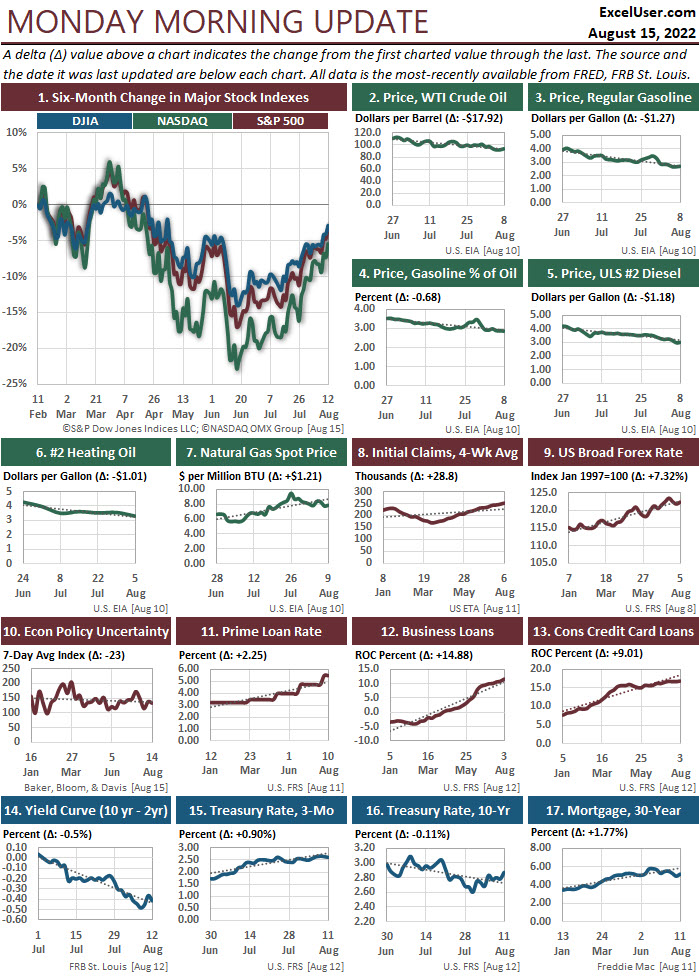
For example, long X-axis labels still slant so that we must tip our heads to read them. And the X-axis typically shows us a hard-to-read mass of complete dates. But in Figure 1 at the right, you can see my workarounds. MY labels don't slant. MY dates show only the date labels my readers need. And MY charts can mark the dates of relevant events, as I've done in Figure 1 for the recessions (light gray column) and presidential transitions (dark red column).
With capabilities like these, you can give your managers just the types of charts they need so they can gain the most insight about your data in the least reading time—and remember it!
(Humans remember trends in charts MUCH more easily than numbers. It probably has something to do with the fact that our distant ancestors survived because they could remember the best hunting trails.)
You'll get working copies of ALL the charts and dashboards at the right in future issues of the Journal.
Project 2: Surge Excel Users' Productivity
In 2003, I wrote my sixth book about spreadsheets, Dashboard Reporting with Excel. But unlike my previous books, my agent couldn't find a publisher for it. They all gave her the same reason: No one cares about such an obscure topic as Excel dashboards!
So I self-published the book and sold more than 100,000 copies.
The worst thing about my book was that I couldn't find a productive way to flow data to my dashboard workbooks. But finally, by Excel 2016, Microsoft gave us the key features we needed—particularly, a robust, built-in version of their Power Query add-in.
What was missing, though, were the data-plumbing methods we needed to flow our data smoothly from our source data, through Power Query, to Excel Tables, to other tables where the data would be staged and transformed, and then to reports—reports that we could modify interactively.
I've made great progress over the years. And I continue to discover new ways to improve both our ultra-productivity with Excel and our reports' presentation quality—discoveries that I'll share in future issues of the Journal.
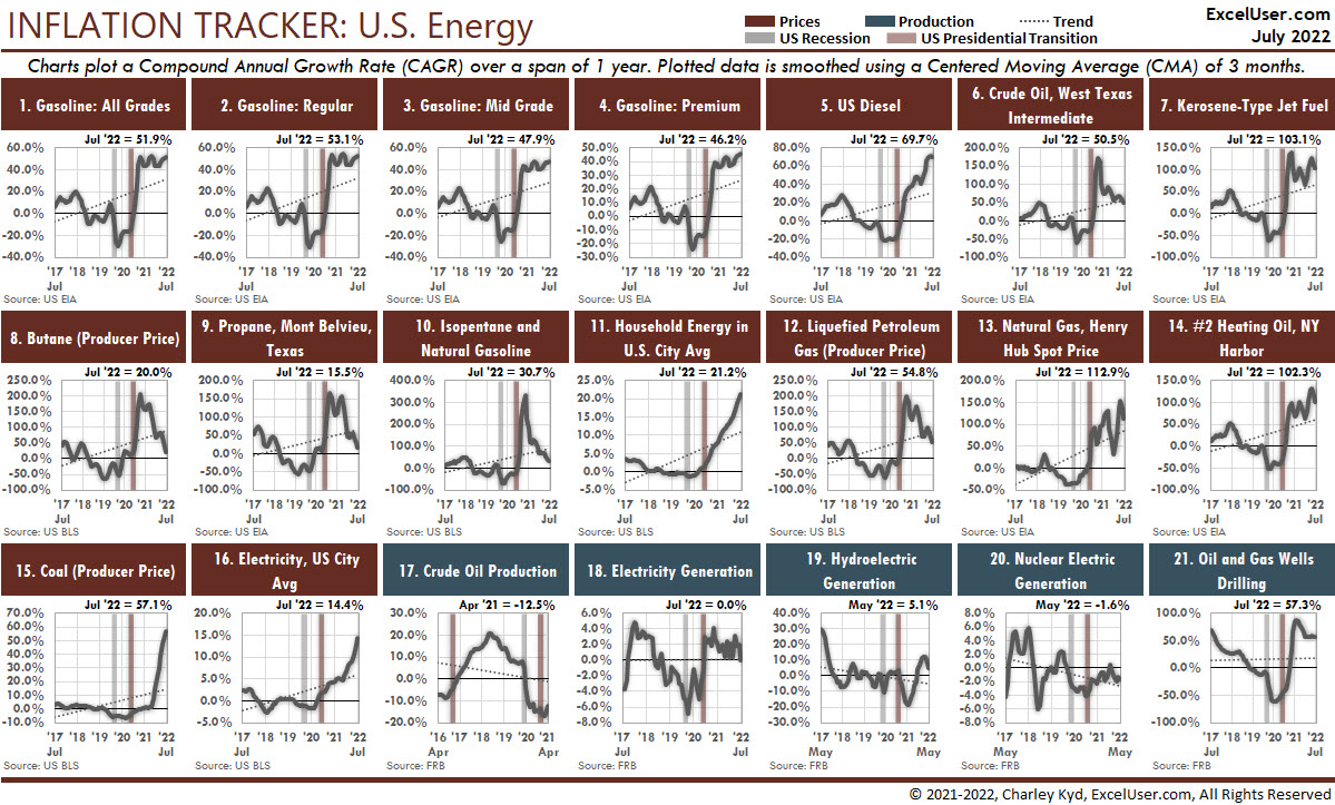
Another slicer chooses the number of years over-which to calculate the average annual rate of inflation.
In future Issues of the Journal, you'll learn how to create dashboards like this from scratch—step by step.
I've also tamed the X axis, added notes above and below the chart, and formatted its title.
In your company, you could use charts like this to show the trend in any measure, in the context of internal and external events—like ad campaigns, hurricanes, reorganizations, and so on.
However, if you set it up to show internal or external data that changes periodically, and the data is available to Power Query, you could update it with one command.
A future issue of the Journal will include this figure and teach you how to create others like it. (I even have a draft of a similar display for Europe!)

The reason is simple: In the hands of an Excel Data Plumber, Excel is the most-powerful tool there is for AGILE reporting and analysis of business data. It's the ONLY tool that supports both data analysis and data presentation!
And companies around the world will really need help from ultra-productive Excel users for decades to come!
For decades?
The United States' last bout with high inflation lasted for more than 20 years. During those 242 months, U.S. inflation ranged from 2.2% to 14.6% and averaged 6.3%. Also, during those months, we were in a recession or non-recessionary downturn 53% of the time.
And internationally, on average, when the U.S. was in a recession over the past fifty years, 78% of the OECD countries also were in a recession!
Even so, many companies flourished during those years. And today, good managers around the world are looking for ways not merely to survive this stagflationary environment, but to flourish, as well. And they need YOU to help them!
Managers need the ultra-high productivity and non-obvious insights that only Excel Data Plumbers can give them. And the ONLY place you can learn how to become an ultra-productive Excel Data Plumber—while also having time for a personal life—is in the Excel Data Plumber's Journal.
Now it’s time for a decision. The way I see it, you have three options...
Option #1: Do absolutely nothing new and stay exactly where you are right now.
If you don't mind working long hours to crank out Excel scutwork, by strict deadlines, for the rest of your career...
And if you have enough to retire in case of a layoff...
And if you're not interested in creating Excel work that you're proud of, then perhaps the Journal isn't for you.
Option #2: Do it yourself.
By working evenings and weekends for many years, like I did, you can try to work out a productive system by starting with what you learned in Lesson 1...
You can try to set up templates with Power Query queries to download FRED, NED, and your company's data quickly and easily...
You can try to set up Excel reports designed to make your managers more productive—like the ones I've been working on for 30 years.
You might be able to pull it off in the next several decades.
Maybe.
Option #3: Let me do the heavy lifting for you.
I'll send you Issue 2 of the Journal within minutes after you subscribe. That issue will teach you how to create a specific function query that you'll include with most Power Query workbooks that you'll create for the rest of your career.
And in Issue 3, you'll learn how to download from FRED the leading indicators that Oracle recently recommended that CFOs follow, indicators that you'll display in your first Excel dashboard several issues later. As usual, you'll be able to update your report with one command.
Your company's managers need all the help you can give them! They're facing stagflation that could last for decades. And it's likely to get worse before it gets better. So the sooner you become an Excel Data Plumber, the more valuable you'll be to your company and its managers.
That's why I'm doing all I can to make it as easy as possible for you to subscribe to the Journal today. It's why I've TEMPORARILY set your initial subscription price to LESS THAN ONE-THIRD of the original price!
In the next few months, I'll add two significant features to your subscription:
▶ The Private EDP Forum, where you can ask questions, get feedback about your Excel Portfolio, and offer advice to other Excel Data Plumbers. (In the meantime, you can just email your questions to me.)
▶ The Public Excel Portfolios Online, which will be an SEO-rich set of pages with your Excel Portfolios—if you choose to participate. Because your portfolio will contain only public data, you'll have no problem showing off your work freely. Because you'll be able to include commentary in your reports, you'll be able to demonstrate your business knowledge in your Portfolio, not just your Excel knowledge. And because you'll be able to display your Portfolio with one URL, you'll be able to add that URL to your email signature, resume, and personal business cards.
After I get the Forum and the Portfolio pages set up in the next few months—and as inflation rages, as the world falls more deeply into recession, and as more layoffs occur—the more valuable the Journal will become. And the price for new subscribers will return to its earlier level.
But as a founding member, your subscription price will NEVER rise. That's why NOW is the best-possible time to subscribe!
The Excel Data Plumber's Journal offers the only Excel training in the world that's designed to...

This Excel chart shows the growth rate of Apple's revenue over time—in the context of U.S. recessions (gray columns) and downturns (blue columns).
As you can see, the growth rate of Apple's revenue increased for long periods only when the economy wasn't in a downturn.
Your CFO might not even know that the U.S. has such a thing as a non-recessionary downturn! Few people do.
A future issue of the Journal will include this chart and teach you how to build it. You can update it with one command, of course.


Sometimes in reports like this, we'll need at least one more slicer to scale the data. Otherwise, we'll need very wide columns for very big numbers—which will make reports for entities with very small numbers look very strange.
Scaling the data is never a problem. It's just one more step that we must remember to take when we intend to display entities with both large and small values with the same layout.

▶ Slash your Excel errors & scutwork...
▶ Surge your Excel brainwork...
▶ Trap new errors automatically,
▶ Save time for your personal life...
▶ Create Excel work you're proud of...
So subscribe NOW, while you can at this very low price.
$47 per subscriber per month
You can unsubscribe at any time.
The Excel Data Plumber's Journal is the new and much-improved version of my Excel Productivity training, which I introduced in 2017.
The following is an entirely unsolicited testimonial, which appeared in my LinkedIn account one day. The emphases are mine.
Charley Kyd’s Excel Productivity course was a life saver for me. The knowledge, methods and overall skill in Excel I acquired while taking the course proved essential in navigating two of the most difficult years in my career.
We were understaffed, business was at a crossroads, and we needed not only data analysis but useful insights in sales, marketing, and logistics. The course provided both.
Using Charley's unique, and deceptively simple method, we streamlined raw data from various sources, cleaned and combined it, and used it to draw conclusions in ways that our ERP could never provide. The course itself is well structured, easy to follow with plenty of supporting material, and sources for further study.
The concept taught is groundbreaking with many aha! moments throughout. I find myself often returning to the material only to discover something new.
I have used the knowledge acquired not only in my professional activities but to track household matters and even my investment portfolio.
Highly recommended.
Nick Triantafyllou, Head of Finance
Total Health Solutions,
Athens, Greece
To get ahead and stay ahead of today's economic turbulence, subscribe now to the Excel Data Plumber's Journal. The price will rise soon.
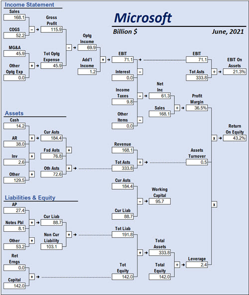
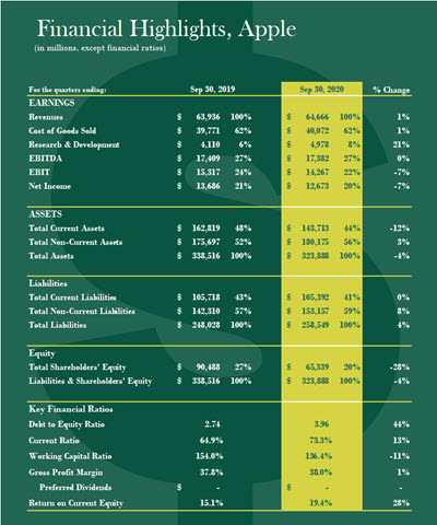
By the way, one of the methods you'll learn in the Journal is how to calculate any of the ratios and totals shown here—for any date—with one short formula, and no side calculations.
$47 per subscriber per month
You can unsubscribe at any time.